Simplicity in Design. Do You Know What Makes Product Design Great?
The idea of simplicity in design is nothing new, but in today’s world of more, more, more, it’s easy to start throwing ideas at problems and heaping feature upon feature to products (feature creep!), inevitably resulting in complex designs that are confusing, hard to use, and no longer serve the original consumer need well. But when it comes to innovation, sometimes less is more. Learn why simplicity is vital to great product design – and how you can apply it to your thinking.
The idea of simplicity in design is nothing new. Before Steve Jobs ever donned a black turtleneck and uttered a mantra surrounding “focus and simplicity,” there was Dieter Rams in the 1970s crying, “Good design is as little design as possible.” Leonardo da Vinci is credited with saying, “Simplicity is the ultimate sophistication,” centuries earlier. We can even go all the way back to Vitruvius in the 1st century BC, whose principles of design, though written in reference to architecture, consisted of the very relatable firmitas (strength; the durability of the design), utilitas (utility; a design’s usefulness and suitability for the needs of its intended users) and venustas (beauty; is it pleasing to the eye?) – and were in all likelihood the foundation of what we consider to be good, simple design today.
Why does simplicity in design matter?
In today’s world of more, more, more, it’s easy to start throwing ideas at problems and heaping feature upon feature to products (feature creep!), inevitably resulting in chaotically busy design solutions that are confusing, hard to use, and no longer serve the original consumer need. This is especially true with today’s focus on tech, where applying trends (“connected” this and “voice-enabled” that) is easier and more cost-effective than ever, not to mention in the bullseye of trend. In any case, more tech doesn’t always equal more value or even more utility.
Simplicity in design, on the other hand, is really about getting back to the essence of an experience or a product to speak directly and earnestly with consumers about solving their real problems— and doing so in an elegant way, sans bells, whistles and other irrelevant junk. This is vital in product design because it’s what attracts and keeps customers, and most importantly, it makes customers feel like your brand understands them in a way no one else does. In other words, achieving simplicity in design helps you stay dialed into your user’s needs, makes it feel more like you hear them, and allows you to efficiently focus on solutions that best address the specific problem you’re solving for.
So how do we make sure we’re designing with simplicity in mind?
There are two questions we always ask ourselves to check if we’re achieving the elegant simplicity we’re seeking:
Are we telling the right story?
Do we have the right perspective?
STORY
Storytelling has become a bit of a buzzword in product development, but that doesn’t make it any less important with regard to the design process. Why? Because consumers view products as a means to an end, and often we need to provide the narratives to help them picture the world they COULD be living in where their needs are met by our solutions. The truth is that people don’t go shopping for objects, they’re in search of solutions, experiences, and emotional resonance that bring lives to a desired aspirational state (this could be a plethora of different scenarios like being free of pain, or being able live without worry, or being full of joy and satisfaction). One of our strongest tools for creating a connection between our clients and their customers is our ability to create simple, thoughtful, and vivid stories around possible futures where we’ve met the needs of real challenges they face. Throughout every project, no matter how big or small, we’re continuously sifting through our ideas to find the right ones by asking ourselves, “are these solutions helping us tell the simplest version of the most impactful and most relatable story we can?”
We, at THRIVE, feel that the only way to write this narrative in a way that is truly relevant is to start with design research and learn about the consumer, gathering insights about their values, needs, and behaviors in order to identify the stories that will resonate with them on a visceral and emotional level. We work hard to distill the gathered data into insights, frameworks, and personas — aggregated fictional characters of the research respondents based on real-data — that provide our clients with an authentic and relatable view of their target consumer. The result is we can better connect with consumers on an emotional level and tell stories about how the new products and services we define will impact their lives. Simply, by viewing the world through your persona’s eyes, you can begin to see your product as more than just an object, and instead something with the potential to make lives better in the most relevant and compelling ways possible.
Try this.
Think about a traditional story arc: our hero (your customer or end-user), comes up against a problem or is faced with a seemingly insurmountable challenge (this is the pain point your product needs to solve). Without anyone to turn to, the hero has arrived at your doorstep, where you have the exact thing to meet their challenge (your product). Think about how easily this simple story can become overloaded; think about how wrong it goes in big-budget movies: there’s that other hero from another movie, oh look, a romantic storyline, we should set up a cliffhanger for the sequel. Before you know it, you can’t remember why the hero started his journey in the first place, and you can’t wait for the movie to JUST END ALREADY. Trying to be everything to everyone is the biggest threat to achieving simplicity in design and can mean that your solution can ultimately get lost in the noise. Designing with the goal to create a focused and simple narrative will not only help your users better understand their own problems and frame your solution within that context but also act as an important filter that will help you make decisions that will lead you to more relevant, satisfying designs that inherently feel like they just fit.
A real-world example.

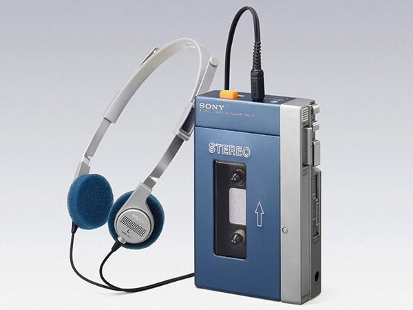
The story of how the Sony Walkman was born is the perfect example of how this idea plays out. As the story goes, in the late 1970s Sony co-founder, Masaru Ibuka, (our character) wanted a portable device to be able to listen to tapes of opera music on planes. While Sony had an existing product that could play cassettes — the TC-D5 — it was designed as a recorder to be used for quick playback by secretaries and journalists; sure, Masaru could have used it, but it was big, bulky and not ideal for carrying around (the conflict or pain point). The solution: a playback-only version that was optimized for portability and headphone use by removing the unneeded record function and external speakers and adding stereo sound for better listening via headphones. It would go on to sell 385 million units, and change the way we listen to music forever, thanks to a character, a challenge, and simplicity in design.
PERSPECTIVE
The second key thing we consider when striving for simplicity in design is the perspective we take at the project onset. Just as it is hard to build a house on a shaky foundation, we believe we must force ourselves to first think “Are we seeing the challenge ahead of us the right way, or are we seeing it through the lens of the past and is there a better way to frame the problem?”
We live in a world of existing paradigms — widely accepted beliefs about the way things are or should be. This is often “baggage” that can impact innovation and design; these are based on assumptions that things can’t change (or a capitulation that it would be too hard to change them) and lead to burdening future-forward ideas with complicated workarounds that make them more palatable because we believe we must kowtow to historical expectations. We find that more often than not, projects without any introspection result in solutions that feel overloaded, complex, or intimidating, or even worse, bury transformative ideas beneath layers of pandemonium that only serve to perpetuate our collective inability to evolve.
Instead, at THRIVE, we believe it is essential to see every challenge with a fresh, unbiased perspective. In product design, you might miss a novel, simpler solution if you allow the patterns of history to force the same complex avenues of the “right way,” rather than challenging these assumptions to see if it’s just the way we’re used to. It’s similar to the cognitive bias known as functional fixedness: a tendency to see things only in the way they are traditionally used. Psychologist Karl Duncker’s classic candle/box experiment demonstrates this. Participants were given a candle, a box of thumbtacks and a book of matches, and asked to attach the candle to the wall so that it did not drip onto the table below. Most tried to attach the candle to the wall with the tacks, or to glue it to the wall by melting it. The real solution was to use the tack box as the candleholder and affix it to the wall with tacks, but most participants couldn’t see the box as more than a container for the tacks.
Try this.
The key to the candle box challenge was literally thinking outside the box — a phrase that’s often used in business and innovation. To effectively overcome functional fixedness, challenge yourself to remove preconceived assumptions about a process or a product. Start by breaking the experience or a complex thing down into its individual parts. Then, examine all the constraints that you’ve inherited, and ask yourself if they exist for a good reason or just because no one has ever tried it a different way. It’s an easy jumpstart to restructuring a problem in your mind so you can attack it from a new angle.
A real-world example.
What can we learn from Adidas’s approach to sustainable footwear? One of the sportswear industry’s biggest challenges is the environmental impact of their footwear; when sneakers wear out, they’re thrown out. Recycling is usually out of the question because materials have to be separated prior to recycling and a typical shoe is made of lots of different stuff that’s been glued or stitched together (Adidas standard trainers include more than 12 materials, for example). The industry’s long-held assumption was that each material had specific performance characteristics and they could not be substituted without sacrificing something. Alas, manufacturers believed they could only influence construction and disassembly, which resulted in complicated solutions. This included robot machines that cut seams and tore shoes apart, solvents that dissolved the adhesives that were also are terrible for the environment, and even exploding shoes.
Rather than continue down these paths, Adidas reexamined the entirety of the lifecycle and what could be done with performance through the current state of materials. They shifted their perspective away from the way things had “always been done,” and found that the simplest solution for a sustainable high-performance sports shoe came via challenging the long-held belief that the only way to achieve the desired performance was with a range of different materials: Engineers at Adidas figured out how to craft a shoe from a single material (thermoplastic polyurethane) that could be manufactured in different ways to achieve the desired performance, and how to construct it without adhesives or other chemicals. Called the Futurecraft Loop, its components are fused together using heat and pressure — a method, they say, that might form an even stronger bond than traditional adhesion methods. This meant that not only assembly was easy, recycling was also easy: grind it up and make another shoe out of the same material – truly achieving simplicity in design.
Simple, right?
At THRIVE, we have the ability to look at things objectively to help you take a more critical look at your products with simplicity in design in mind — something that can be difficult to do from within an organization. Contact us today to talk about our design research and industrial design expertise, and how we can help make sure you’re applying the principles of simplicity to your new product.


